Bookit Design
Overview
Nursi will be booking software and searching the beauty sector for customers to book appointments at their local salons.
Challenge
Many people experience hesitation and uncertainty when searching for beauty services. The CEO asked me to find a way to improve what is already on the market. The website will be to encourage customers to download the app
Role
Role: UX Designer & UI Designer
Timeline: 3 months
Platform: Android & ios mobile apps
Team: Ovidiu (CEO), Filip (CEO), Paul James (UX&UI Designer), Kapal (Manger), Vishal Yadav (coder)
Approach
Focus group
Competitive Analysis
Feature prioritization
How might we
Usability tests
Tools used
Figma
Photoshop
Figma Jam
Jira
Results
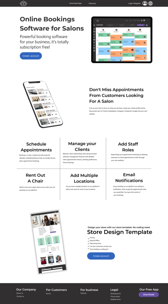
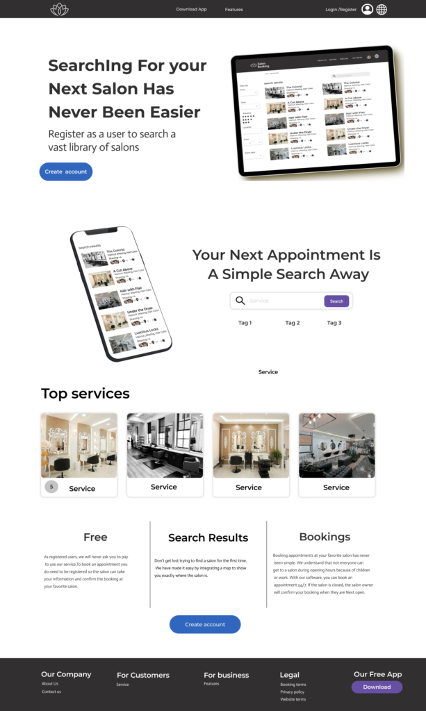
Nursi app uses natural language to help potential customers search for a beauty service in their local area. It empowers customers of any gender to book a service to give them confidence in any social situation.
The Process
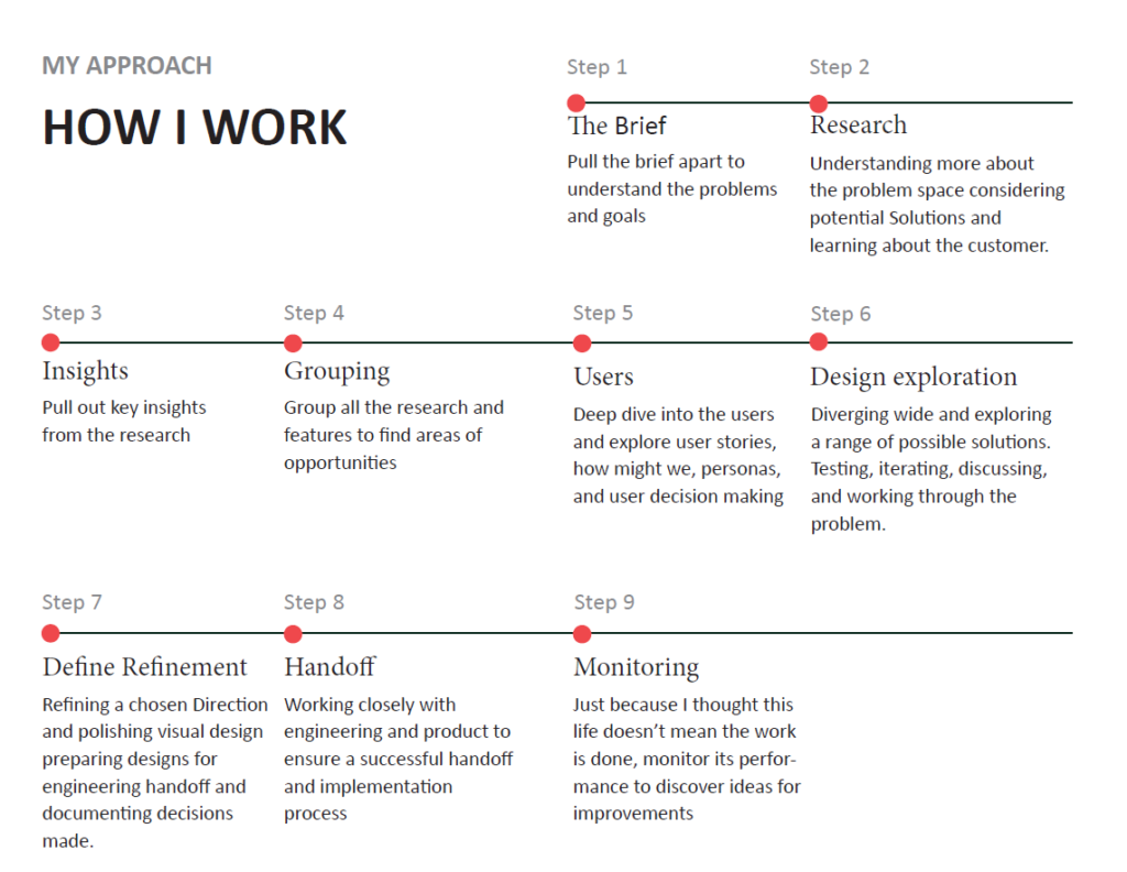
We work to the double diamond in four stages, and each one of them stages has multiple sub-categories. Eat stage has been split up into the four different categories that you can access by clicking the dropdown menu or you can look at my approach in a brief overview
I sat down with the stakeholders to understand the goals, objectives, and potential customers. After talking with the stakeholders, I decided I would use a focus group, competitive analysis, feature prioritization, how might we, and usability testing to help understand the goals, objectives, and potential customers.
The focus group helped understand what the customers looked for and what put them off when booking an appointment at a salon online/offline. The competitive analysis helped to understand the pros and cons of the competition.
The research from the discovery phase helped to find key insights and areas of opportunities that we could benefit from by including them in our app. After grouping the content into a feature prioritization from high to low priority to help understand the more important features that we could include in the app design. After finishing the features prioritization I started to do some, “how might we” to come up with some ideas on implementing the insights and areas of Opportunity into the design.
After the Discovery and define stage, all the people working on this project had a meeting to evaluate the finding, and give their ideas, and feedback.
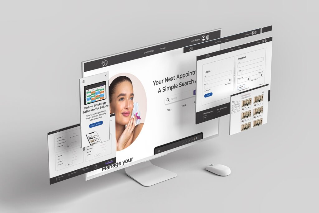
After talking with the other team members and getting their feedback. I moved into wireframing and designed some prototypes to test between the teams before moving into the low-fidelity designs. Once the low fidelity design where done, we did usability testing on them to see what potential customers had to say about the app. From the feedback given from the potential customers. I changed a couple of things within the design because of their feedback. Then moved over to high fidelity designs for handing it over to the colder (Vishal Yadav)
The Research
The research was conducted in different stages that can all be found below within the drop-down menu. Each part of the research helped us to understand what we was going to include within the designs of the apps.
We started by introducing ourselves and having a general chat at first to make everyone feel comfortable. Once we got started, I asked.
1. What does everyone look for when booking appointments at a salon online/offline?
2. Is the location of the salon important?
3. Would you travel further for an appointment if you enjoyed talking to a particular staff member at a salon?
Findings
Images of the salon can persuade customers to use that salon. Some customers will travel that little bit further if they like the staff in a particular salon. Customer reviews about the salon are important for other customers when booking with that salon for the first time.
Fresha:
Pros
Custome salon pages
Special offers
Cons:
Pay to set up a profile
information on salon
Simplybook.me:
Pros
Reviews
Notifications
Cons
Hidden fees
Customer service
Premier software:
Pros
Customer texts
Online payments
Cons
No reviews
Extra fees
High priority
A “salon page” for more information
Customers would like to receive “Notifications” on their upcome appointment.
Custom images of the salon
Medium priority
Customers would like to receive a text message about their appointment
Customer reviews
Low priority
Making online payments for the customer’s upcoming appointment
How might we make it easier for customers to cancel bookings?
How might we make it easier for customers to find more information about the salon?
How might we pick the employee offering the service?
User flow & wire frames

Final Designs