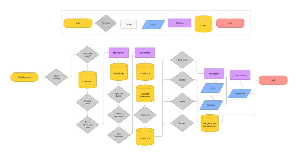
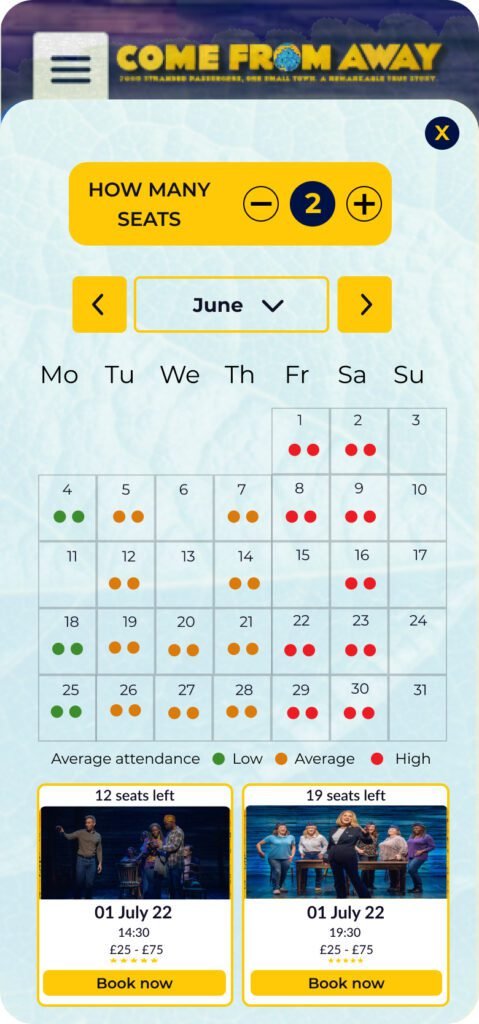
THE CHALLENGE

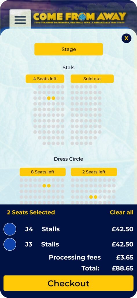
The Purchase Flow team recently ran a usability study with 5 new users experiencing the Come From Away booking journey. The study found that customers, with a flexible date to see a performance and who navigated to the seat map page, wanted a way to see the least busy performance in a month.

RESEARCH & PLANNING

With a fairly detailed project brief in hand, we first created an online survey to get an idea of the common pain points experienced by users looking to buy tickets and the factors that influence their decision-making process. We distributed our survey through various channels, including the Facebook page, and within 24 hours were able to begin synthesizing data from 33 respondents.

Some common themes we noticed very early on: many participants were interested in being able to easily know how many seats were left for a show. Given the short-form nature of our survey responses, I conducted interviews with 7 participants to deep-dive into answers and collect more qualitative data. I wanted to identify specific ways in which we could streamline the booking experience, and learn what supplementary information would be most valuable to our participants. In addition, I wanted to pin down the biggest pain points for customers that could easily be addressed with a mobile app.

Affinity diagram aggregating the needs wants and pain points of the users interviewed. Unfulfilled interest in the show was often due to an inability to immediately convert that interest into a ticket purchase. Concerns about visitor volume, seating availability, and general uncertainty about checking out taking too long were also factors that prevented customer’s booking.

DESIGNING THE SOLUTION

Our user research uncovered clear pain points that we needed to address with our app design. First, we would need to make it easy for users to find information about seating, including dates and remaining seats for the show. Our app would also need to make it simple to get to the payment flow and, once there, simplify the process of navigating from calender to payment screen(s). While most of this information was available, the fact that these frustrations were mentioned repeatedly in user interviews indicated that we needed to improve on the existing information architecture.

INFORMATION ARCHITECTURE

user flow

Business goals and enhance the overall experience

To address the business goals and enhance the overall experience. Creating user flows. We also created flows for in-app ticket purchases.

Since our users wanted a way to access additional information on seating and how busy a show is from within the app, we opted to make them available for users to see how many seats were left for a show. In addition, it would let the user see how busy that show is as off the time of buying a ticket.

Purchasing tickets took too long because of user’s personal details, by adding other options for checking out, the user could save time by not having to fill out all their details.

EARLY SKETCHES

While sketching key screens for creating user flows, I drew inspiration from a similar companion that most directly addressed user wants and needs uncovered in our user research.

PAPER PROTOTYPES

I created simple paper prototypes to perform usability testing of each user flow and validate our designs. The set of user tasks was comprehensive—in addition to ticket purchases, we had users attempt to find out how many seats were available for a show.

Designs

CONCLUSION

We could only qualitatively assess how well our design accomplished the goals defined in the project brief. We performed usability testing and conducted follow-up interviews to evaluate the effectiveness of our design and found that the updates exceeded expectations, particularly about ticket purchases and proximity-based information discovery for seats remaining.

Overall, the features we designed were described as helpful, effective supplements to the booking experience, so I can confidently say we accomplished our goals.