Psa Surveys
Seeing through users’ eyes and improving user experience through Navigation, Layout, and Section Consolidation
MY ROLE & RESPONSIBILITIES
As the solo designer, my roles and responsibilities in this project included: user interviews, market research, and user research to define existing problems and ideate potential solutions. In addition, I created user flows, wireframes, and prototypes and led user testing sessions.
TEAM
We were an agile team of 4 members, including me, a developer, a product owner, and a product manager. We collaborated on each research and design task.
OVERVIEW
PSA Surveys is a software tool specifically designed for companies looking to assess their distributors’ carbon footprint and CO2 emissions. It allows users to create, distribute, and analyze surveys. It also allows users to analyze the data, identify improvement areas, generate reports, and track progress over time.
It is designed to help companies lower their supply chain’s environmental impact and comply with environmental regulations.
However, the previous software version had several usability issues, leading to users’ confusion and frustration. So, I was tasked to redesign it to improve its usability and functionality.
PROBLEMS WITH EXISTING DESIGN
- The main issues with the existing PSA Surveys software were its outdated design, lack of user-friendly navigation, and limited reporting capabilities.
- The software could not track progress or compare data from different distributors over time.
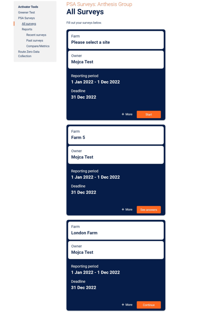
- The previous version of PSA Surveys had a linear layout for survey cards and a confusing navigation menu that included both a navigation menu and a breadcrumb menu.
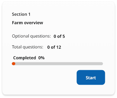
- The survey sections only showed the user how many optional questions there were, and only using a percentage did not keep the user engaged or encourage them to complete the survey.
- The process of starting and setting up a survey was not in the order the user expected, and some surveys had many sections, making it difficult for the user to manage their time.
- When a user sets up a survey, they can create their own instructions page, but we have no control over the design of that page.
- When the user takes the survey, they need to enter the website they want to take it on before starting it. This process is not in the order the user expects, as it is similar to going to the market, paying for your shopping, and then going shopping.
- The survey sections only show the user how many optional questions there are, and only using a percentage does not keep the user engaged or encourage them to complete the survey.
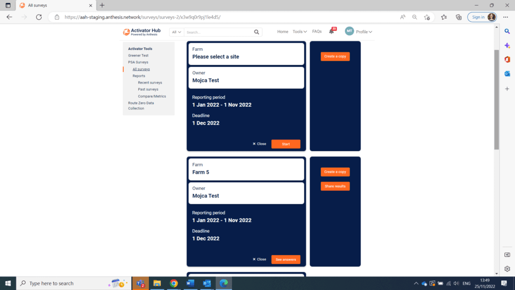
- Before starting the survey, the user can click “more,” and an extra box will open with a duplicate button. Once the survey has started, when the user clicks “more,” they will also see a share button. If the user clicks “more” before starting the survey, they may not click it again, thinking that the extra button only appears after the survey has started.
CHALLENGE
- The requirement to maintain the software’s existing functionality limited the scope of design changes that could be made.
- The need to work within the constraints of the existing technology and infrastructure.
OBJECTIVES
- Add new features such as real-time data tracking, data visualization, and progress tracking
- Improve the reporting capabilities to allow for more detailed and accurate analysis
- Improve the user experience by making the navigation and layout more intuitive and user-friendly.
- Encourage users to complete the survey by making the process more manageable and engaging.
- Streamline the process of assigning the survey to another person and sharing the results.
THE DESIGN PROCESS
Discover & Understanding
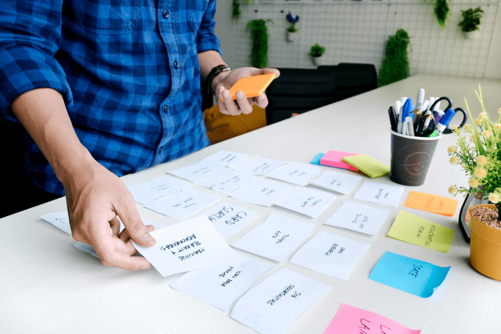
The project’s first step was to research the problems users were facing with the previous version of the software and what the service was trying to achieve. The research included user interviews and market research.
MARKET RESEARCH
We conducted market research to understand the needs and preferences of the target users and identified any pain points or frustrations that users may have.
Demographics
- The primary users of the software are environmental managers and sustainability professionals
- The majority of users are between the ages of 25 and 45, with a slightly higher proportion of females
Preferences
- Users prefer software that is easy to use and provides clear insights into the environmental performance of their distributors
- Users prefer software that can streamline their work and save time
- Users prefer software that can measure and track the environmental performance of their distributors
- Users prefer software that can identify areas for improvement in the environmental performance of their distributors
User Behaviors
- Users are actively researching and staying up-to-date on sustainability trends and best practices
- Users use data and analytics to measure and track the environmental performance of their distributors
- Users use software to manage data and analyze the performance
- Users prioritize efficiency and streamlined work processes
- Users are open to trying new tools and technologies to improve their work
Future Potential
- As the focus on sustainability and environmental protection continues to grow, there is a potential for an increase in demand for software that can help companies to measure and track their environmental performance
- As technology continues to advance, there is a potential for new features and capabilities to be added to the software to improve the user experience further
DEFINE – EMPATHIZE
We conducted qualitative and quantitative research to understand users’ needs better.
QUALITATIVE INFORMATION RESEARCH
Firstly, we performed qualitative information research to give ourselves some direction. For example, we found –
- The frequency at which users experienced difficulties while performing various tasks.
- The pain points, fear, and needs currently experienced by the users.
- What motivates or demotivates them from using the previous version of the software?
The qualitative information research helped us confirm invalid user assumptions and expectations regarding the software.
USER INTERVIEWS
We conducted one-on-one interviews with current users of PSA Surveys to gather feedback on the previous version and identify areas for improvement.
Interview Questions:
- Can you tell me about your experience using the previous version of PSA Surveys?
- What challenges did you face while using the previous software version?
- What features or capabilities would you like to see added to the software?
- How do you currently measure and track the environmental performance of your distributors?
- How do you currently identify areas for improvement in the environmental performance of your distributors?
- How important is the ease of use and efficiency when it comes to software you use for your work?
- Are there any specific challenges you faced when sharing and collaborating on the survey results with your team or other stakeholders?
FINDINGS
The findings revealed that users found the navigation and layout confusing, the process of completing the survey was not intuitive, and the survey sections only showed the number of optional questions, which did not keep the user engaged or encourage them to complete the survey. Additionally, the process of assigning the survey to another person and sharing the results was not streamlined.
Users wanted to see more features and capabilities added to the software, such as the ability to track and measure the environmental performance of their distributors and the ability to identify areas for improvement in the environmental performance of their distributors.
DESIGN – WHAT IS NEXT
The findings revealed that users found the navigation and layout confusing, the process of completing the survey was not intuitive, and the survey sections only showed the number of optional questions, which did not keep the user engaged or encourage them to complete the survey. Additionally, the process of assigning the survey to another person and sharing the results was not streamlined.
Users wanted to see more features and capabilities added to the software, such as the ability to track and measure the environmental performance of their distributors and the ability to identify areas for improvement in the environmental performance of their distributors.
BRAINSTORM
After consolidating all issues and prioritizing them according to their frequency, the data’s outcomes and brainstorming enabled us to narrow down the approach.
- The navigation menu and breadcrumb menu will be separated, and a clear breadcrumb and toolbar will be implemented.
- The survey sections will be consolidated into a single card, and the duplicate and share buttons will be repositioned to the top right corner.
- A progress bar will be added to encourage users to start and complete the survey.
- The survey setup will be incorporated into the main card, and a message will be added to prompt the user to select a site if they click “start” without selecting a site.
- An onboarding experience will be added to guide new users through the process, only appearing when mistakes are made.
- A feature will be added to display the survey deadline prominently on the left side of the page, and the number of optional questions and total questions within a section will be added.
USER FLOW
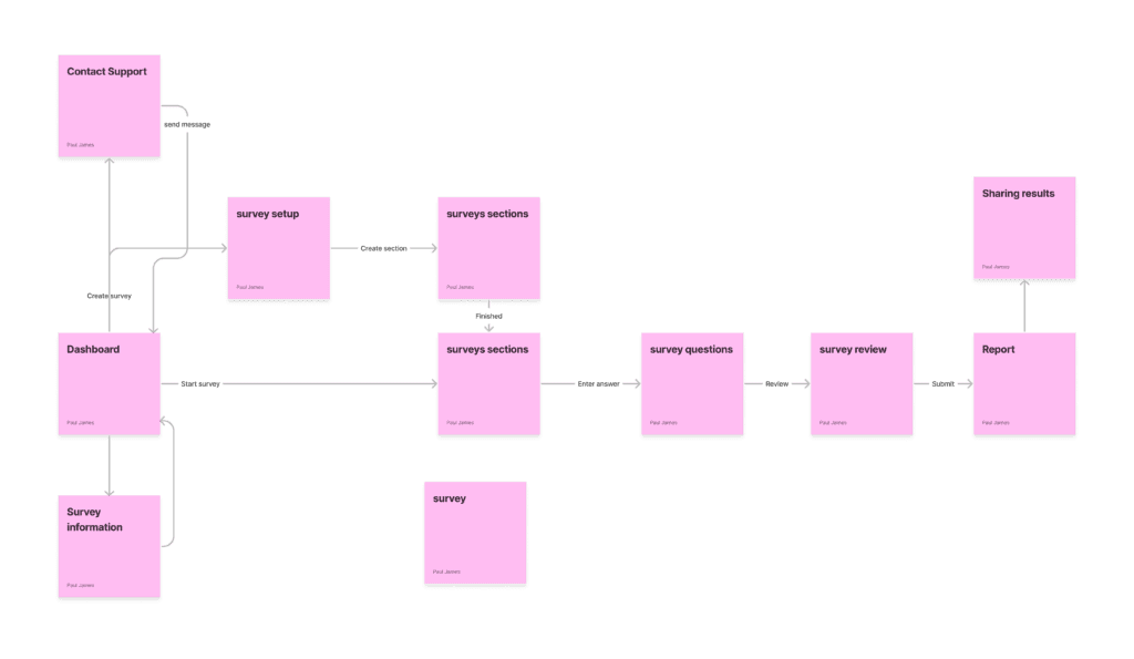
Throughout the user flows, we determine where each tab must be. Mapping out the users’ steps helped us create a frictionless user flow that allows them to quickly and seamlessly perform the most specific tasks in the software. Every scenario in the software will be easily visualized at this stage.
SOLUTIONS
WIREFRAMING
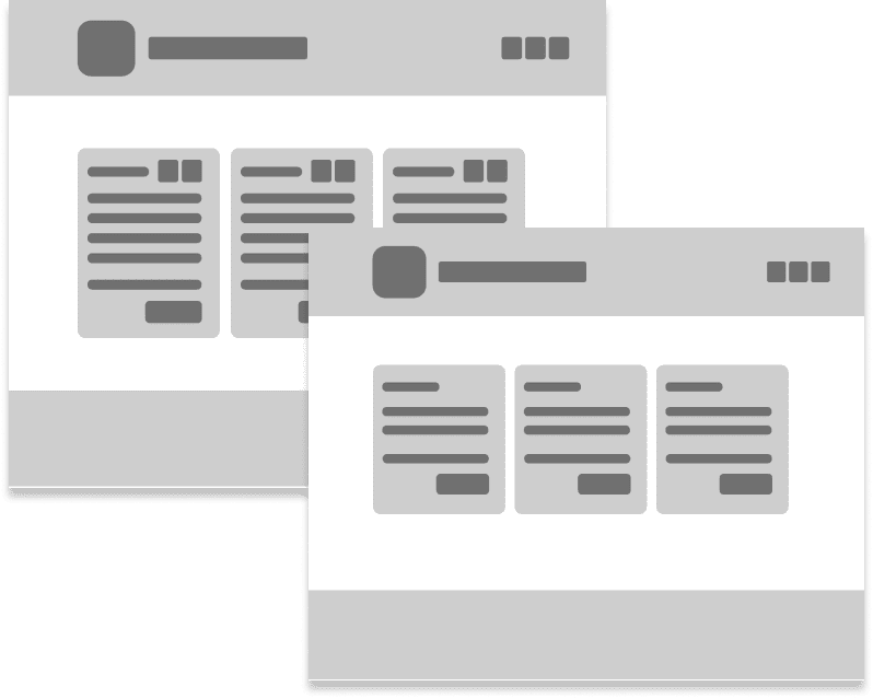
We created wireframes of each screen based on the features we brainstormed and arranged them according to the user flow. Wireframes helped us conceptualize the basic blueprint of the software early in the design process.
Designs
We created clickable prototypes using Figma to define the functionality, content, and navigation, maintaining interaction and visual consistency to communicate the design strategy effectively. This is considerably quicker than diving into the complex software build.
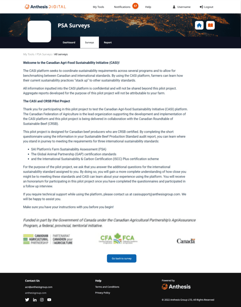
THE INFORMATION PAGE
In the previous design, the user interface included both a navigation menu and a breadcrumb menu, which could confuse the user.
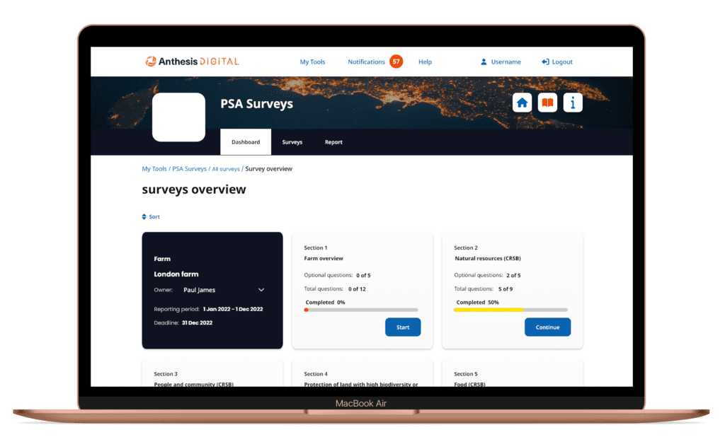
I decided to separate these elements and implement a clear breadcrumb and toolbar to address this issue. This allows the user to easily navigate backward using the breadcrumb or to different sections using the toolbar.
Additionally, this separation allows the user more flexibility when designing their instruction page, as the entire page is dedicated to creating instructions.
THE DASHBOARD
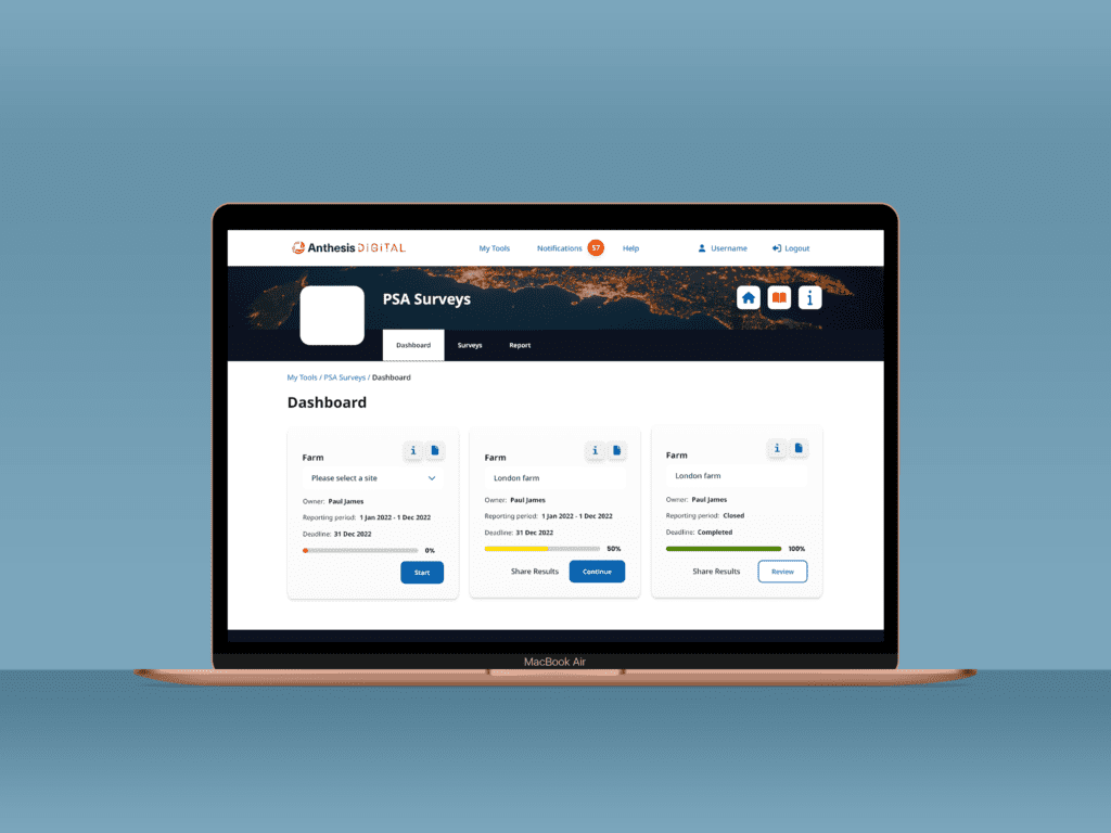
In the previous design, the survey cards were displayed in a linear layout, and when the user clicked on “more” at the bottom, a panel would open next to that section displaying a duplicate button. If users started the survey and clicked “more,” they would also see a share button.
To improve the user experience, I decided to consolidate both of these pages into a single card, as most users of PSA surveys only have one to two surveys.
I repositioned the duplicate button to the top right corner and added a hover effect that displays a message indicating the button’s purpose.
Additionally, I placed an information icon next to the duplicate button, allowing users to access information about the survey at any time quickly.
Furthermore, in the previous design, the user had to click “start” and set up the survey. I incorporated the survey setup into the main card to streamline the process. When users set up the survey and click “start,” they will immediately be taken to the survey. However, if the user clicks “start” without selecting a site, the survey will display a message prompting them to select the site they want to take the survey.
To improve the user experience for new users of PSA surveys, an onboarding experience has been implemented to guide them through the process, only appearing when mistakes are made. This allows experienced users to complete the survey efficiently, without interruption, and get back on track if they make an error.
Additionally, I have modified the main card to include a feature for assigning the survey to another person. In the previous design, this option was available after starting the survey. To avoid encouraging laziness, I have placed this option on the main page without any warning, allowing users to make the decision proactively.
I have implemented a progress bar to encourage users to start and complete the survey. Upon completion of the survey, a review button will be displayed, emphasizing completing the remaining survey rather than reviewing the completed one. However, the option to review remains available for the user.
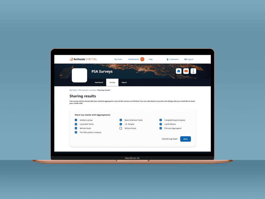
Finally, I have made it easier for users to share their survey results by placing the “Share Results” button at the bottom of the page. This button will direct the user to a page with a list of aggregators, allowing them to select or deselect who to share the results with and make changes at any time.
THE SURVEY
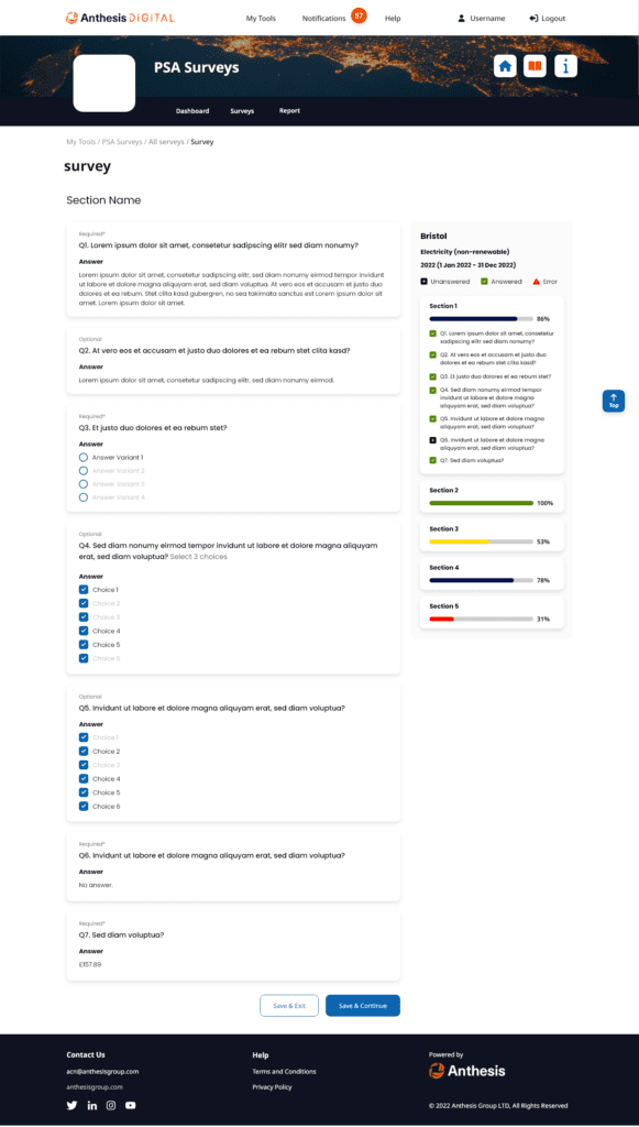
On the survey section page, the questions are displayed on the left, with an overview of the other sections located on the right side, per client requirements.
The overview on the right side lets the user see the number of questions answered in the current section and how many are still to be completed. Additionally, an expansion section on the right side provides the user with information on the remaining sections within the survey.
Upon completing the survey, the user can save and continue, which is the primary button encouraging the user to proceed with the survey. A secondary option, “Save and Exit,” is also available, with a less empathetic tone, in case the user wishes to exit and return to the survey overview.
VALIDATE & DELIVER
Conducting usability testing helps detect issues in the design process. So, we developed testing scenarios and asked the participants to describe their thought processes and difficulties while completing the task.
VALIDATE & DELIVER
Objectives
- To test the effectiveness and usability of the redesigned PSA Surveys software
- To gather feedback on the new design and identify any areas for improvement
- To ensure that the new design meets the needs and expectations of the target audience
VALIDATE & DELIVER
Methodology
- Conducted usability testing with a sample of current and potential users of PSA Surveys
- Users were asked to complete a series of tasks using the redesigned software and provide feedback on their experience
- Testing was conducted in a controlled environment with the use of a screen recording software
- Participants were asked to complete a survey after the testing session
VALIDATE & DELIVER
Results
- The majority of participants found the redesigned software to be easy to use and navigate
- Participants found the new design to be more intuitive and user-friendly than the previous version
- Participants appreciated the new features and capabilities added to the software
SOLUTION
PROJECT OUTCOME
The redesigned PSA Surveys software received positive feedback from users during usability testing. The redesign of the software added new features and capabilities to the software that met the target audience’s needs. Specifically, the redesign improved the user experience, making it easier for users to measure and track the environmental performance of their distributors and identify areas for improvement.
We followed a light design style because we wanted the project to come off friendly and ultimately not give off a technical “database” vibe. Instead, the design will give users a familiar and delightful experience.
One client is currently using the software and is happy with the new look. The full version of the software will go live sometime this year. The project was successfully delivered on time and within budget. The project team received positive feedback from the client and stakeholders on the redesign of the software.
